top of page
Rebranding a Copenhagen icon
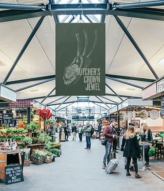
In its 10 year history Copenhagen's main food market Torvehallerne has become an institution for Copenhageners and tourists alike. But the identity needed a modern brush up.
I took inspiration from the robust lettering on produce boxes for typography. The color scheme was lifted from the natural hues of the market's produce. A more flexible logo use and layout was introduced. I wanted the imagery and photography style to reflect a more natural, dynamic and tactile feeling, and lastly a catalogue of beautiful encyclopaedic-style illustrations was developed with the talented illustrator Louise Flansmose to infuse the identity with an ownable graphic brand element.


bottom of page