top of page
Simplifying the order
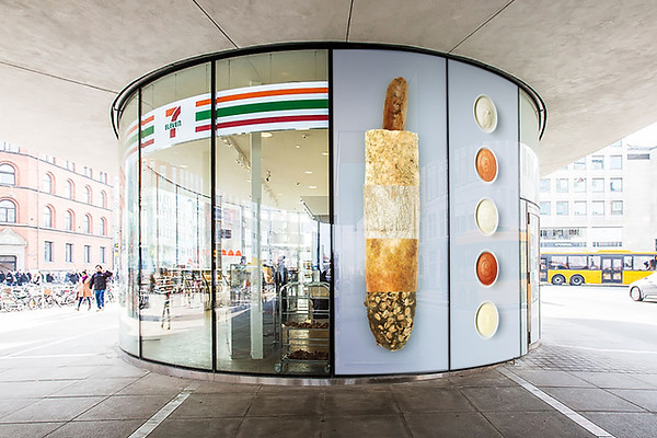
7-Eleven wanted to update their menu boards to reflect a fresher vibe, while making sure to make the ordering process as comprehensible as possible.
I went with an almost pictographic approach, always seeing the products from above, as a way to spell out simple "calculations" for the the collective price of the customer's purchase.
The color scheme was kept fairly neutral and cold as a way to make the organic warm tones of the products pop more.


bottom of page